Note: Please read our WCTW from yesterday. It’s important because it sets the precedent for this article.
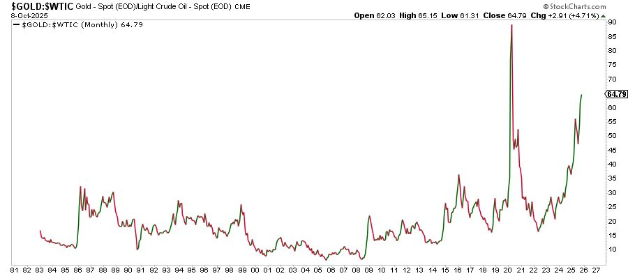
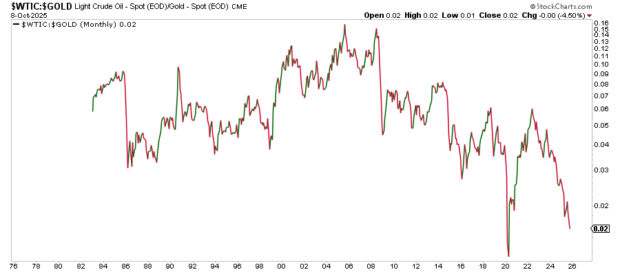
It is quite a remarkable chart no matter how you look at it.
Gold-to-Oil Ratio
Oil-to-Gold Ratio
What’s clear and obvious from this ratio is that 1) the current trend is unsustainable in the long run and 2) things will almost always get extreme before it reverses.
This is how the big macro guys are going to look at this. Now, why is this chart even relevant in the grand scheme of things?
Intuitively, it makes sense. Gold has always served as a haven for real assets. If we frame it in another way, it is also the perception of value for fiat currencies. In periods where investors view debasement of the fiat currency as inevitable (think back to 1970-1980), gold tends to outperform.
In this respect, oil, the commodity that keeps the world running, is a relative value function to the king of commodities. And there have been periods in time where the disconnect between oil to gold reached unsustainable levels, and one of those periods was COVID.
Interestingly enough, we are once again close to the COVID levels, except this time, the rise in the gold-to-oil ratio stems from the severe outperformance we have seen in gold vs the complete demise of oil (like in COVID).
Is this signal important from a macro asset allocation standpoint?
Yes, and I will explain why.


